- 1. Documentation
- 2. Documentation
-
3. JS Jobs
- Basics
- Configurations
- Company
- Job
- Resume
- Job Apply
- Credit System
- Credits Log
- Credits Pack
- Purchase History
- Login & Register
- Applied Resume
- Fields
- Custom Fields
- Message System
- Categories
- Data Dictionary
- Users
- Salary
- System Emails
- Address
- Tags
- Reports
- Shortcodes & Widgets
- Job Alert
- Department
- Cover Letter
- Folder
- JS Jobs RSS
- Translations
- Miscellaneous
- Slug
- Errors
-
4. JS Support Ticket
- Basics
- Configurations
- Ticket Via Email
- Tickets
- Staff Member
- Departments
- Knowledge Base
- Downloads
- Announcements
- FAQ's
- Roles
- Priorities
- Categories
- Premade Messages
- Help Topics
- Field Ordering
- Feedback Fields
- Export
- Feedbacks
- Reports
- Miscellaneous
- Support Area
- Breadcrumbs
- Permissions
- Time Track
- Push Notifications
- 5. Jobi
-
6. JS Car Manager
- Basics
- Settings And Customization
- Vehicle
- Credit system
- Credits Log
- Credits Pack
- Purchase History
- Login & Register
- Fields
- Custom fields
- Make And Model
- Data Dictionary
- Users
- System Emails
- Address
- Reports & Stats
- Visual Composer
- Vehicle Alert
- JS Car Manager RSS
- Translations
- Miscellaneous
-
7. JS Job Manager
-
Basics
- Installation
- Job Manager Admin Dashboard
- Job Manager Home Page
- Custom Homepage & Widgets
-
Homepage & Widgets
- Job Manager Pages
- Job Search
- Jobs By Category
- Latest And Featured Jobs
- Count Box
- Latest Resume
- Pricing Tables
- Latest News And Blogs
- Testimonials
- Companies
- Job Manager Info Text
- Newest Jobs
- 4 Box Style For Job Category
- 3 Box Style For Featured Box
- Job Manager Link With Counter
- Google Map
- Image & Text
- Search With Categories
- Team Members
- News & Rumors
- Price Tables
- Team Members
- Testimonial
- System Requirements
- Uninstall
- Theme Sample Data
- Theme Options
- Configurations
- Company
- Job
- Resume
- Job Apply
- Credit System
- Credits Log
- Credits Pack
- Purchase History
- Login & Register
- Applied Resume
- Fields
- Add Fields
- Message System
- Categories
- Data Dictionary
- Users
- Salary
- System Emails
- Address
- Tags
- Reports
- Shortcodes & Widgets
- Job Alert
- Department
- Cover Letter
- Folder
- Job RSS
- Update
- Translations
- Miscellaneous
- Slug
-
Basics
-
8. JS Learn Manager
- Basics
- Configurations
- Admin Side
- Courses
- Course Fields
- Course Level
- Course Language
- Lecture Fields
- Earning
- Payouts
- System Errors
- Login & Register
- Messages
- Payment Plans
- Category
- Email Templates
- Reports
- Awards
- Activity Log
- Users
- User Fields
- Instructors
- Students
- Country
- Shortcodes
- Instructor Side
- Courses
- Instructor Dashboard
- My Profile
- Edit Profile
- Instructor Message
- Student Side
- Courses
- Student Dashboard
- My Profile
- Edit Profile
- Student Message
- Course RSS
- Slug
- Update
- Miscellaneous
Clear History
Basic Settings
With Jobi you get unlimited possibilities to customize the look of your website. All these things you can easily customize with just few clicks. Basic settings include many useful customization settings, which allows you to adapt Jobi to your project goals and your customer expectations.
Header
Use a Sticky Header for better usability. With Jobi sticky header your main menu and logo will always be at the top of the screen, automatically following when you scroll. This makes it much easier for your viewers to quickly navigate through your site. And you can easily turn the sticky header on or off in our advanced theme options panel.
Favicon - upload ico, gif or png graphic file to replace default Joomla favicon. That icon associated with a website intended to be used when you bookmark the web page. Web browsers use them in the URL bar, on tabs, and elsewhere to help identify a website visually. A favicon is typically a graphic 16 x 16 pixels square, also can use transparency inside. All modern browsers (tested with Chrome, Firefox, IE8, Opera and Safari) will always request a favicon.ico so it's best to always have a favicon.ico file, to avoid a "404 not found" error.
Customizing The Template
Open up this template configuration by go to Template Manager, click on the name of this template and you will see all settings that you can make.
All settings inside each tab are pretty easy to understand and implement, so we won't talk much about those but some common settings.
Using Layout Builder
Now we'll go through settings inside Layout Tab which represents the most advantage feature - Layout Builder. With Layout Builder, you can create/remove/edit positions to display modules dynamically.
Go to Layout tab and you will see something like this
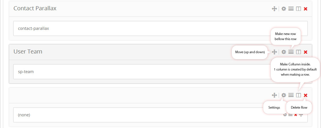
As seen on screenshot, you can mode each row vertically, and horizonally for columns. You can adjust settings for rows and columns by click on cog icon. Adjust these settings are not hard, so explore your own.Keep in mind that you can only display modules in a column, and columns must stay inside a row. These rules are given because the framework is based on Bootstrap. And you won't see those bubles on your screen.
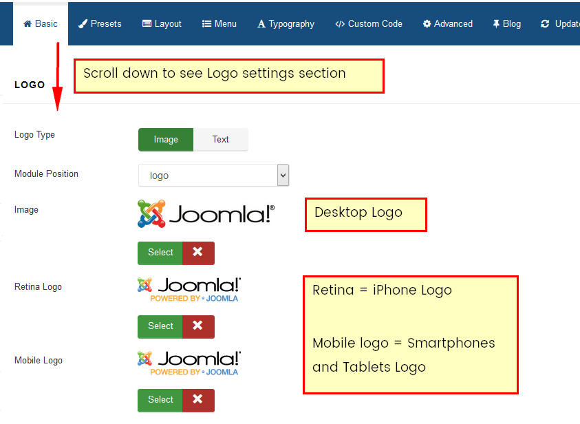
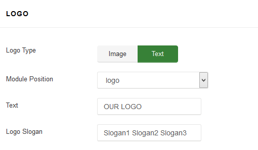
Logo Image
The Logo feature controls the output of the template's main logo in top-header section.
- Logo Type - you can set the logo type as image or text type.
- Logo position - logo can be placed on every available module position. Not only on default "logo" position.
- Image - if you chosen Image logo type, you can upload & use your own logo image (PNG, animated GIF or JPG).
- Retina Logo - upload & use a double size of your original logo dimension to keep look great of higher resolution devices like retina or 5k display. It will work on any retina device but only on safari (iPhone/iPad) and chrome browser.
- Mobile logo - use this logo image for mobile devices only, in most cases use smaller version of default logo, which will be suitable screens in smartphones. Leave it empty if you do not want to show different logo for mobile devices.
Note! If none of those image will be chosen - template will use default logos from template design like jobi logo or template name logo.
Logo and Sticky Header
If you're using sticky header and your main logo is big you may have small problem with it size after page would be scrolled down. But following customization css code may help to improve it. Of course you can change value of max-height according to your needs
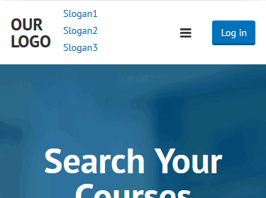
div.is-sticky .sp-default-logo { max-height: 60px;}Text Logo
Text logo may be used when you do not have graphic logo. Also it may help a little bit in SEO purposes.
In that case you can also use text slogan.
Note! Site opened in smartphones and some tablets may have vertical slogan not horizontal. To fix it, you can reduce font-size of slogan or use following code:
@media (max-width: 767px){
 #sp-header .logo p,
 #sp-header .logo h1 { display: block !important;}
 #sp-header .logo h1 {margin: 15px 0 0;}
 }
It will help to reduce partition / separation of longer slogan and text logo.
Before
After
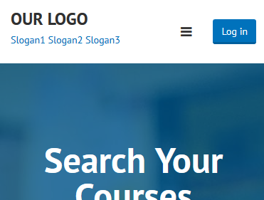
Of course if you do not have login button there (which takes some space) there is a hope that you do not have to customize code.
Use following code to remove slogan on smartphones only:
@media (max-width: 480px) {
#sp-header .logo p { display: none !important;}
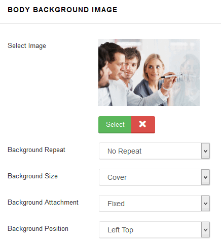
}Body Background Image
If you chosen Boxed Layout (before) you can use that option which allows you to set background image for
without editing or adding custom CSS code- Select Image - select image (JPG, PNG, GIF) which will be used as the background. To remove a background image, simply delete the URL from the settings field.
- Background Repeat - sets how a background image will be repeated. By default, a background-image is no repeated, and the image is placed at the top left corner. Available options: No Repeat, Repeat All, Repeat Horizontally, Repeat Vertically, Inherit from default settings. These values allow you to tile images across either axis of an element (or both axes) but don’t allow for any finer control than that.
- Background Size - sets the size of the background image. Default value is cover - is means scale the background image to be as large as possible so that the background area is completely covered by the background image. The contain keyword sets the image should to scale (proportionately) as large as possible, without exceeding either the height or width of the containing element. Available options are: Cover, Contain or Inherit from default settings.
- Background Attachment - sets whether a background image attachment is fixed or scrolls. Available options: Fixed, Scroll or Inherit from default settings.
- Background Position - sets the starting/initial position of a background image.
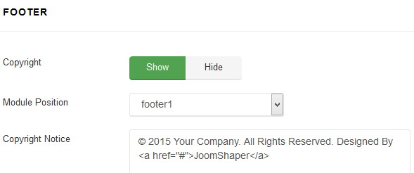
Footer
Template settings allows you also to add custom footer copyright note also with html tags linke href="/" to use link inside. You can select the position where footer section will be published. By default is using "footer1" module position created from Layout Manager. Of course instead using this feature you can publish there alternative module, also Custom HTML. But that solution is much quicker.
Social Icons
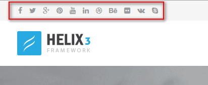
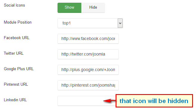
Those social icons are localized in top left corner of template, in that row there can be 11 icons with links to popular social networks serves: Facebook, Twitter, Google Plus, Pinterest, Linkedin, Dribbble, Behance, YouTube, Flickr, VK (VKontakte) and Skype communicator. By default this object is using a "top1" module position.
You can easily disable/enable this feature and choose which social icons must be shown. Remove "#" in input fields to hide icon on front-end.
Contact Information
Instead using a Custom HTML module you can use this feature to show small contact info in top right corner, which include phone number and e-mail address.
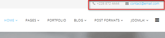
Phone icon and e-mail icon are added automatically and they are based on Font Awesome. By default this object is using a "top2" module position.
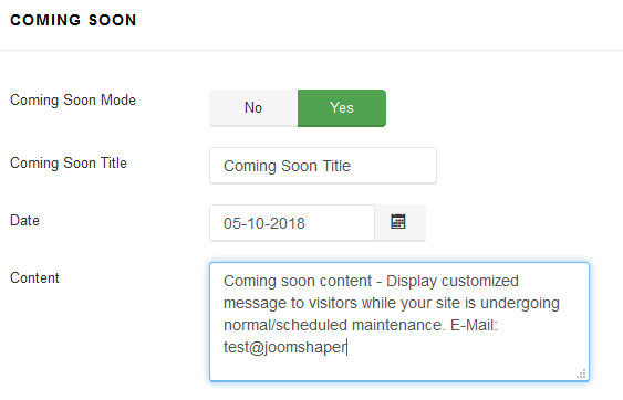
Coming Soon
This mode can be used to replace default off-line mode. It creates a Coming Soon page for your Joomla 3.4 website while it's under construction and shows countdown timer & short message from your visitors, instead login module.
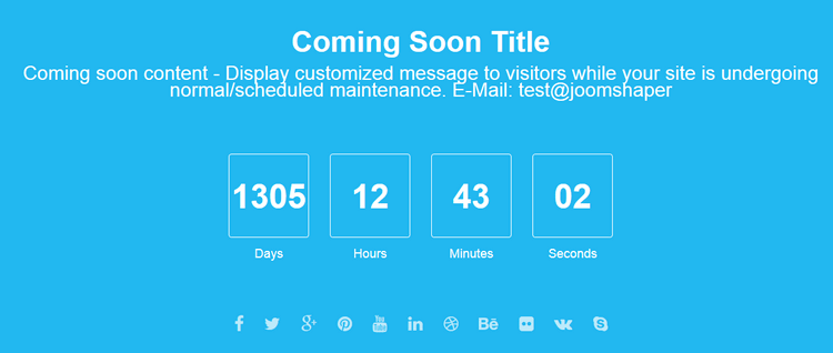
Is the important key for business company or organization after they purchased a domain, but they have not started the development website yet, so coming soon page very primary option for temporary use. It is very useful if you intend to launch a new project because it inform your potential readers that you are working on something.
Found errors? Think you can improve this documentation? Simply click the Edit link at the top of the page, and then the icon on Github to make your changes.